Ask The Maker 2024 - Text Guide
Jul. 27th, 2024 05:18 pm
Hello and welcome to "How to get away with using the same font over and over again or as I like to call it - a Text Guide". I'm not really good with words, so bare with me while I explain how I put... you guessed it - words on my icons. I don't even know where to begin with this, so I guess let's get directly to the questions in the ATM 2024 thread.
How you choose your fonts or font combinations?
I have over 500 fonts and somehow I always keep choosing the same ones lol But to be honest, there are many cool fonts out there, but most of them don't really look good on the tiny canvases we use for making icons. Choosing your fonts/font combination depends entirely on how much text you're going to put in the icon. Lately I've been using pretty long quotes, so I always need a "basic" font that looks good on small size and is still somewhat readable. My favourite if no one has figured it out yet (I use it only on 99% of my icons, I'm pretty sure no one has noticed shhh) is Aliens and Cows, but most of the other Serif/Sans Serif type of fonts will work as well. For the second font I usually pick something "fancy", mostly some handwritten type of font, which only highlights a word or two of the text.
What's your thought process on composition (where to place the subject, where to place the text, how large to make the text)?
90% of the time I usually go with a center crop, it's the easiest and I like how it looks and how it balances the space in the icon. From there on I can start working on the background, adding textures and text accordingly. As to where to place the text and how big to make it, it really depends on the chosen cap. I like to mix small with big text, it shakes things up and makes them more interesting. Also don't be afraid to go crazy and play around with the placement and cut parts of the text, the people familiar with your fandom will already know what it says, and the people who are not simply won't care. Anyway, most of the time these are my go to.
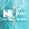
For a far crop/full body crop/or anything with lots of negative space I usually place the text behind the subject.

For closer crops - I do the opposite and put the text in front of the subject (either on the side or at the bottom of the icon).

And sometimes I do a mix of both.


Other tips & tricks
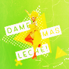
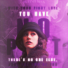
The text tool in Photoshop offers different things that can enhance your text. Besides the regular Bold, Italic, etc. you can try to Vertically/Horizontally Scale your text or change the spacing between the letters. The purple icon above may seem like it has different fonts, but it's actually only the good old Aliens and Cows font. Also try to mix & match colors, either by using lighter and darker shades of colors already in your icon, or with colors that go well together (white goes with everything, wink wink).
Favourite fonts


Links: 1. Aliens and Cows 2. Rainfall 3. Summer Pisces 4. Droid 5. Viper Nora 6. Woodcutter Jet-Set 7. Bestermind 8. Master of Break 9. Galacticastle 10. Sastica Nora
Bonus: Favourite textures
I was asked for my favourite textures as well, but it doesn't make sense to make a new post about it, so here they are. If I say I overused these a lot, that will be a big understatement


lookslikerain x4 | maexxchen
Honestly everything by lookslikerain I have used a lot-lot, so definitely recommend to check her community :)
Enjoy!
no subject
Date: 2024-07-27 07:21 pm (UTC)no subject
Date: 2024-08-14 05:32 pm (UTC)no subject
Date: 2024-08-14 07:06 pm (UTC)I so blame you for this icon, cause I kept staring at the textures you posted. Now I wish I had asked you for a full page of favorite textures lol.
no subject
Date: 2024-07-27 08:33 pm (UTC)I see how your text behind the tiny subjects actually makes them stand out!
no subject
Date: 2024-08-14 05:35 pm (UTC)I often use text as a kind of "decoration", especially when I'm too lazy to find a fitting texture. And it really elevates the composition and makes it more interesting, even if it's one big letter :D
no subject
Date: 2024-07-28 07:26 am (UTC)great post - grabbed some of the fonts that i don't have!!
no subject
Date: 2024-08-14 05:36 pm (UTC)Especially when I spend half an hour figuring out what to put for the text, and after that I don't want to spend another half an hour to pick another font :D
no subject
Date: 2024-07-31 11:49 am (UTC)Also, thank you SO MUCH for linking the fonts. I have... *cough* 2200 fonts installed, but only one of those! (Well, I got the aliens and the pisces from your last tutorial, but apart from that, the only one I have is Master of Break.)
no subject
Date: 2024-07-31 01:23 pm (UTC)Lol.. 2200... my Photoshop will crash every few seconds. After I wrote the guide, I reduced mine to 200 and downloaded a bunch of new ones, hopefully they will work well on the small canvases :D
no subject
Date: 2024-08-03 03:57 pm (UTC)no subject
Date: 2024-08-14 05:31 pm (UTC)no subject
Date: 2024-08-14 05:44 pm (UTC)no subject
Date: 2024-08-06 03:21 am (UTC)no subject
Date: 2024-08-14 05:40 pm (UTC)no subject
Date: 2024-08-16 12:30 am (UTC)no subject
Date: 2025-01-24 09:30 pm (UTC)no subject
Date: 2025-01-24 09:43 pm (UTC)